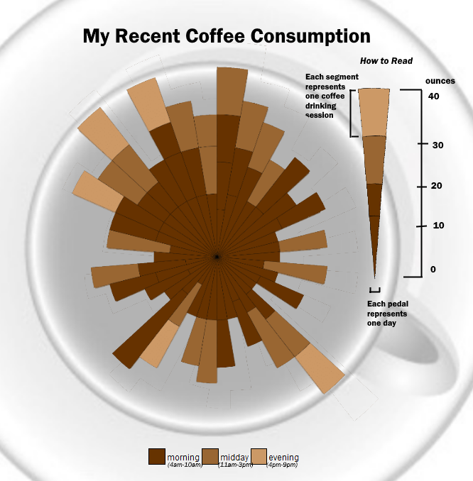
Summary: I recently tracked my daily coffee consumption and thought it would be interesting to find a fun way to visual it. After some exploration of options in R, I decided to give a Nightingale Rose Diagram a try.
library(ggplot2)
So I tracked the past 40 or so days of my coffee consumption. It was a method as simple as using the notepad on my phone and listing down the number of ounces per coffee drinking session I had. Variables I tracked were day, time, and volume. While there is probably plenty of other possibilities that could have been interesting if I tracked a little more, I opted to keep it simple and easy to do so I wouldn't begin to neglect the input of the data.
After some exploration I opted to go with a Nightingale Rose diagram to display this information. Not only does it show overall comparison between the days, but also shows patterns over time and informs on the portions of a whole.. a lot of different trends to show in just one visual!
On top of this, I found the radial representation to work nicely when discussing coffee. With this in mind, I ended up removing all of the R fluff (title, background, axis, etc). This allowed me to paste the chart over top of a coffee mug (done in paint.net). While this made it maybe a more interesting of a visual overall, it also detracted from the explainability of the visual. To counteract this, I ended up printing out a single petal to the side of the chart and provided a 'How to Read' section.
I'm overall happy with how this one turned out. While its almost impossible to determine exactly how much coffee I had daily, I think it provides a nice display for overall pattern depiction.
Below is the (relatively simply) code to make a Nightingale Rose in R.
df <- read.csv('../data/intake.csv')

ggplot(data = df, aes(x = day, y = ounces, fill = phase)) +
  geom_bar(stat = 'identity', width = 1, color = "black", size = 0.1) +
  coord_polar() +
  scale_fill_manual(values = c('#CC9966', '#996633', '#663300'))+
  xlab("") + ylab("") +
  labs(fill="") +
  guides(fill = guide_legend(reverse=TRUE)) +
  theme(
    legend.position="top",
    legend.direction="horizontal",
    panel.grid.major = element_blank(),
    #panel.grid.minor = element_blank(),
    panel.border = element_blank(),
    panel.background = element_blank(),
    axis.title.x=element_blank(),
    axis.text.x=element_blank(),
    axis.ticks.x=element_blank(),
    axis.title.y=element_blank(),
    axis.text.y=element_blank(),
    axis.ticks.y=element_blank()
  )

Code was tweaked to pull just one petal as well. Afterwards everything was thrown together in paint.NET with the final result below!